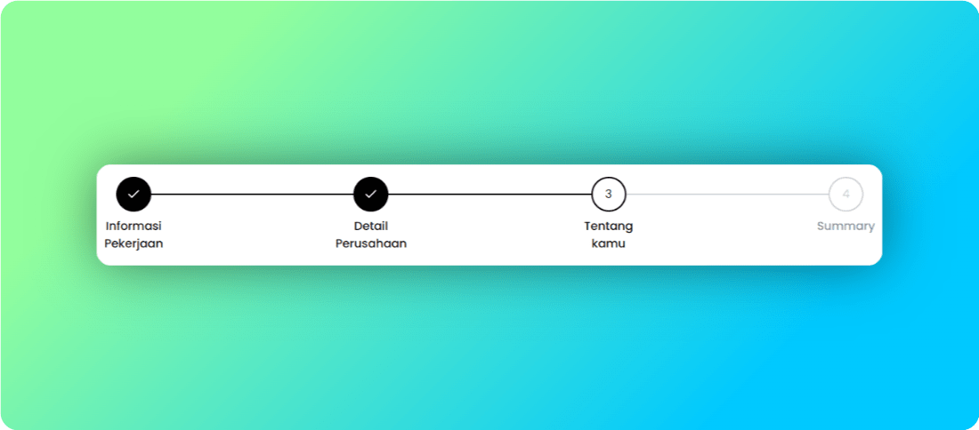
When I was working on my personal project using TailwindCSS and ShadCN, I found it difficult to find a stepper component. So, I created a simple custom stepper component. It only requires two parameters: the total steps and the current step. Here is how I did it:
import React from 'react';
import { Check } from 'lucide-react';

interface StepperProps {
  steps: string[];
  currentStep: number;
}

const Stepper: React.FC<StepperProps> = ({ steps, currentStep }) => {
  return (
    <div className="w-full">
      <ol className="flex items-center w-full">
        {steps.map((step, index) => {
          const isCompleted = index < currentStep;
          const isActive = index === currentStep;

          return (
            <li
              key={index}
              className={`flex items-center ${
                index !== steps.length - 1 ? 'w-full' : ''
              }`}
            >
              <div className="flex items-center relative">
                <div
                  className={`w-12 h-12 rounded-full flex items-center justify-center border-2 ${
                    isCompleted
                      ? 'bg-black text-white border-black'
                      : isActive
                      ? 'border-black text-black'
                      : 'border-gray-300 text-gray-300'
                  }`}
                >
                  {isCompleted ? (
                    <Check className="w-5 h-5" />
                  ) : (
                    <span>{index + 1}</span>
                  )}
                </div>
                <div className="absolute top-4 -ml-4 text-center mt-10 w-20 flex items-center justify-center">
                  <p
                    className={`text-md font-medium text-center ${
                      isCompleted || isActive ? 'text-black' : 'text-gray-400'
                    }`}
                  >
                    {step}
                  </p>
                </div>
              </div>
              {index !== steps.length - 1 && (
                <div
                  className={`flex-auto border-t-2 transition duration-500 ease-in-out ${
                    isCompleted ? 'border-black' : 'border-gray-300'
                  }`}
                ></div>
              )}
            </li>
          );
        })}
      </ol>
    </div>
  );
};

export default Stepper;
The result looks like this:
If you want to use a different icon, you can always replace the check icon. In this example, I am using the check icon from lucide-react.
That’s it. Hope this helps, and see you in the next post!
